Fred Segal E-Commerce
Not in an egotistical way or in a bragging way, but in a statistical way, the fact is, I truly created jeans sportswear. I have to scratch my own head because I can’t believe how big it got. I can’t even believe how gigantic it is. – Fred Segal
CLIENT Fred Segal
Founded in 1961, legendary retailer Fred Segal is synonymous with Southern California lifestyle and laid-back luxury. With a highly curated point-of-view that attracts celebrities and international jet setters, this one-of-a-kind store has secured its place in pop culture as the West Coast’s most iconic style destination.

01
Design Brief
Fred Segal is looking to create an innovative, interactive exhibit site that integrates the heritage, the now, and the future of Fred Segal.
02
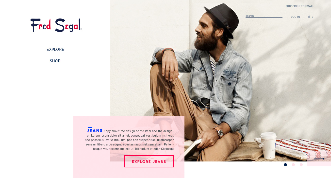
Homepage
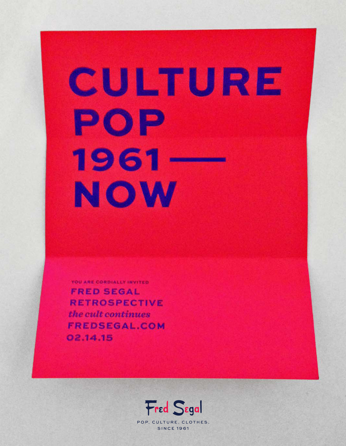
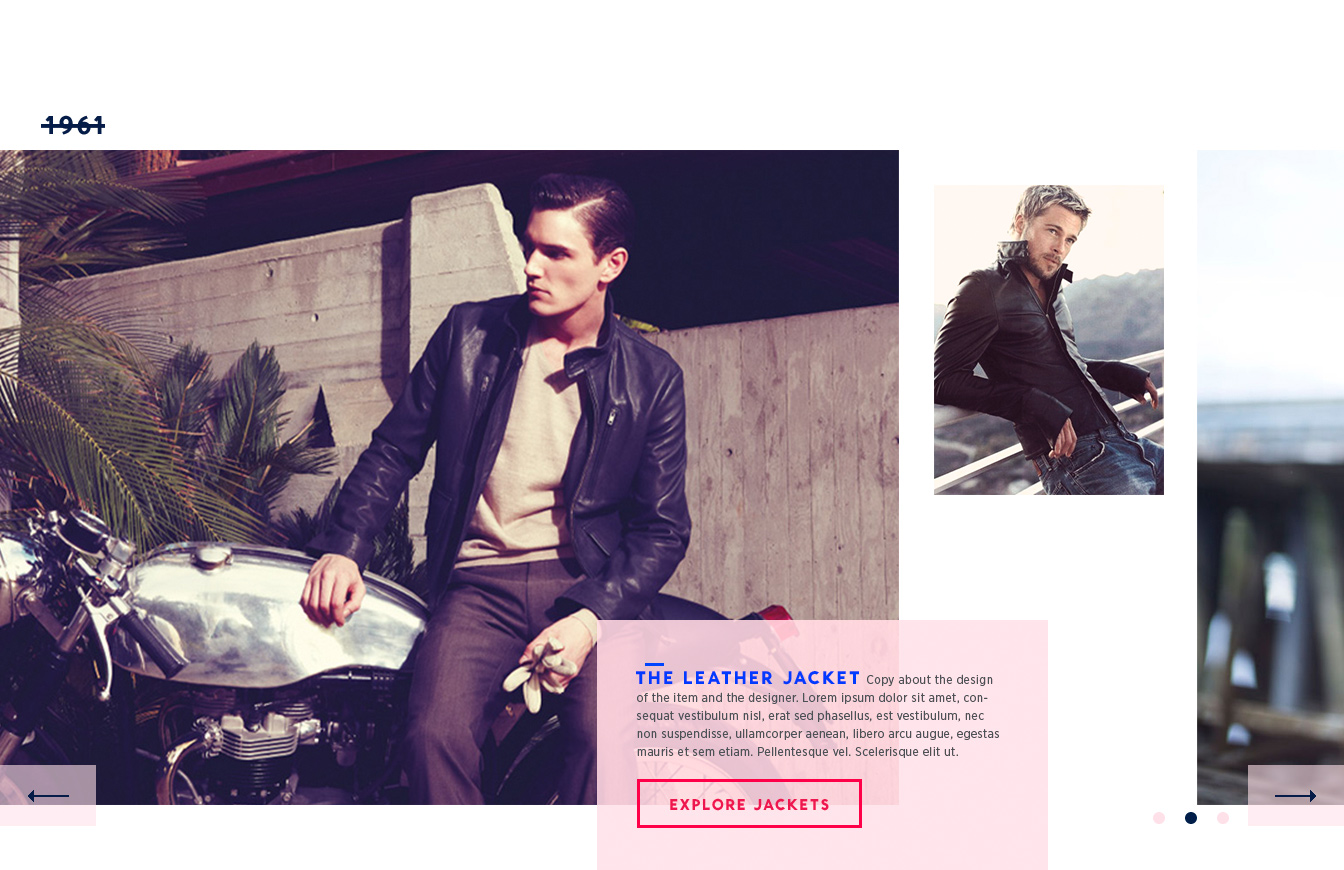
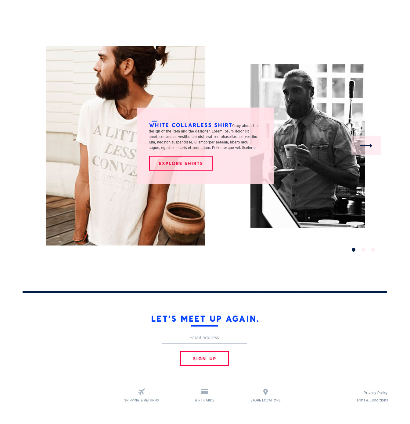
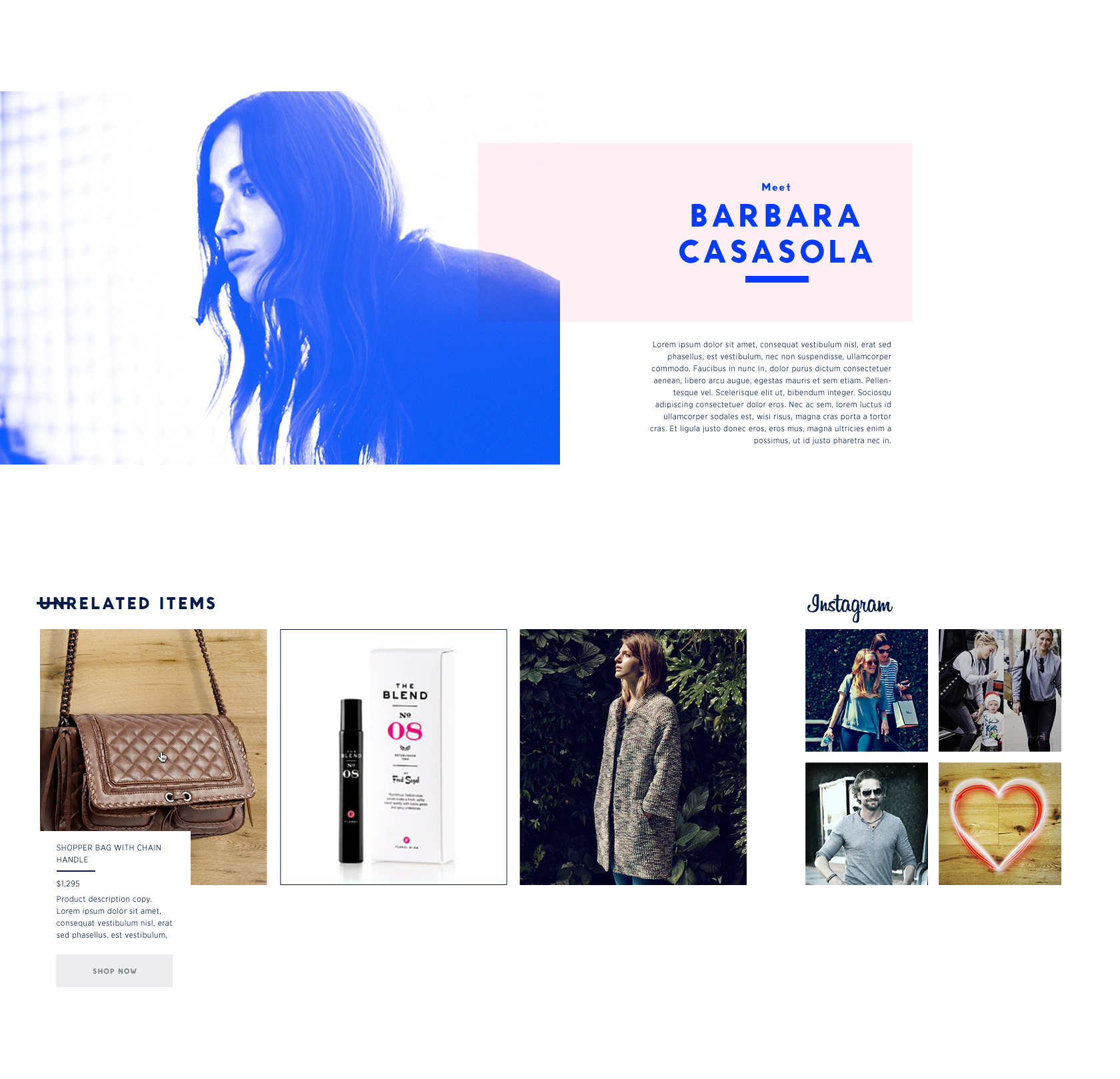
The Homepage is designed with a nod to Fred Segal’s historical graphic elements appropriated to a new yet familiar digital visual language.
Only a handful of carefully curated items are displayed on the website at a time which allows for the design to have a little playfulness while encouraging the discovery of unique pieces.
03
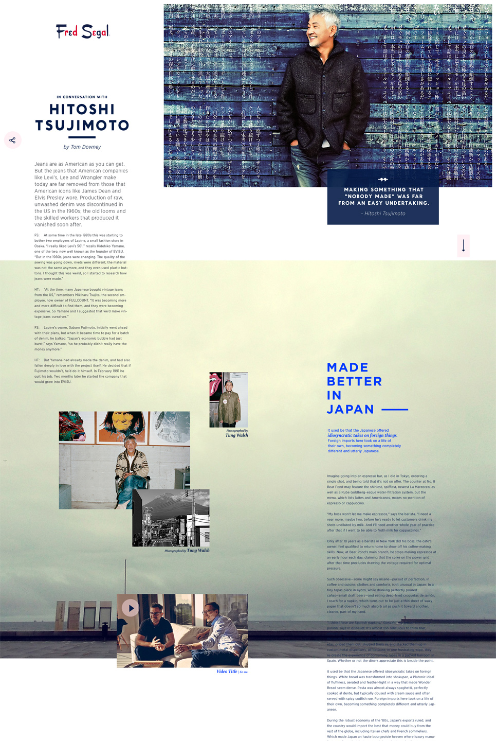
Product Detail Page
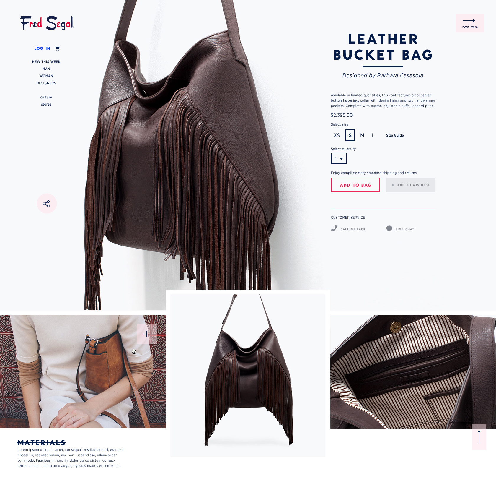
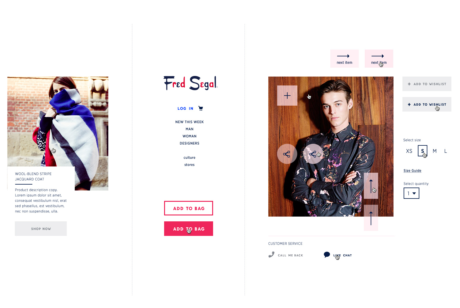
This page is dedicated to the item—its details, its story, and the designer behind it. The goal is to make you feel the essence of the piece and appreciate its effortlessly understated cool.
04
Visual Language
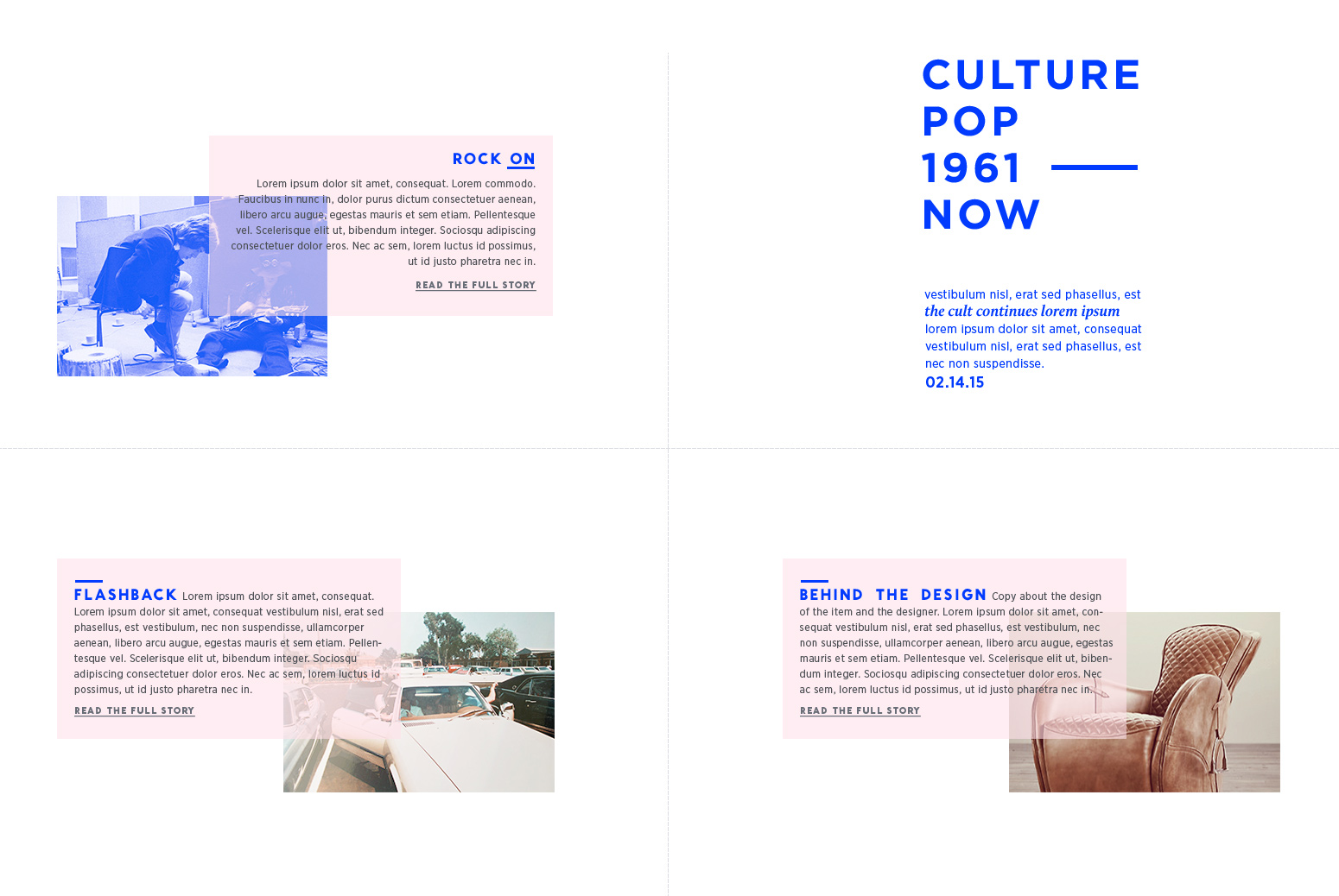
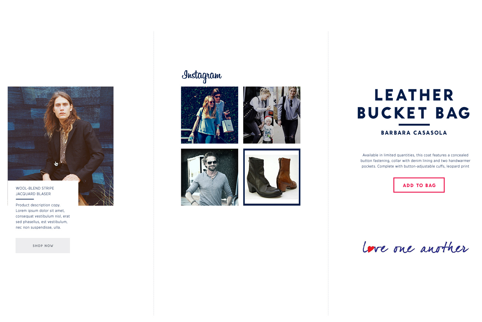
The visual language is composed of the Editorial voice and the Primary and Secondary UI elements.
The photography always leads, while the copy quietly conveys essential information with a call to action.
Primary UI, like the navigation and the CTAs are prominent and bold, they are the second most important element on the site after photography.
Secondary UI elements are meant to support the content, the design is kept intentionally quiet, the elements are only there when you need them.
05
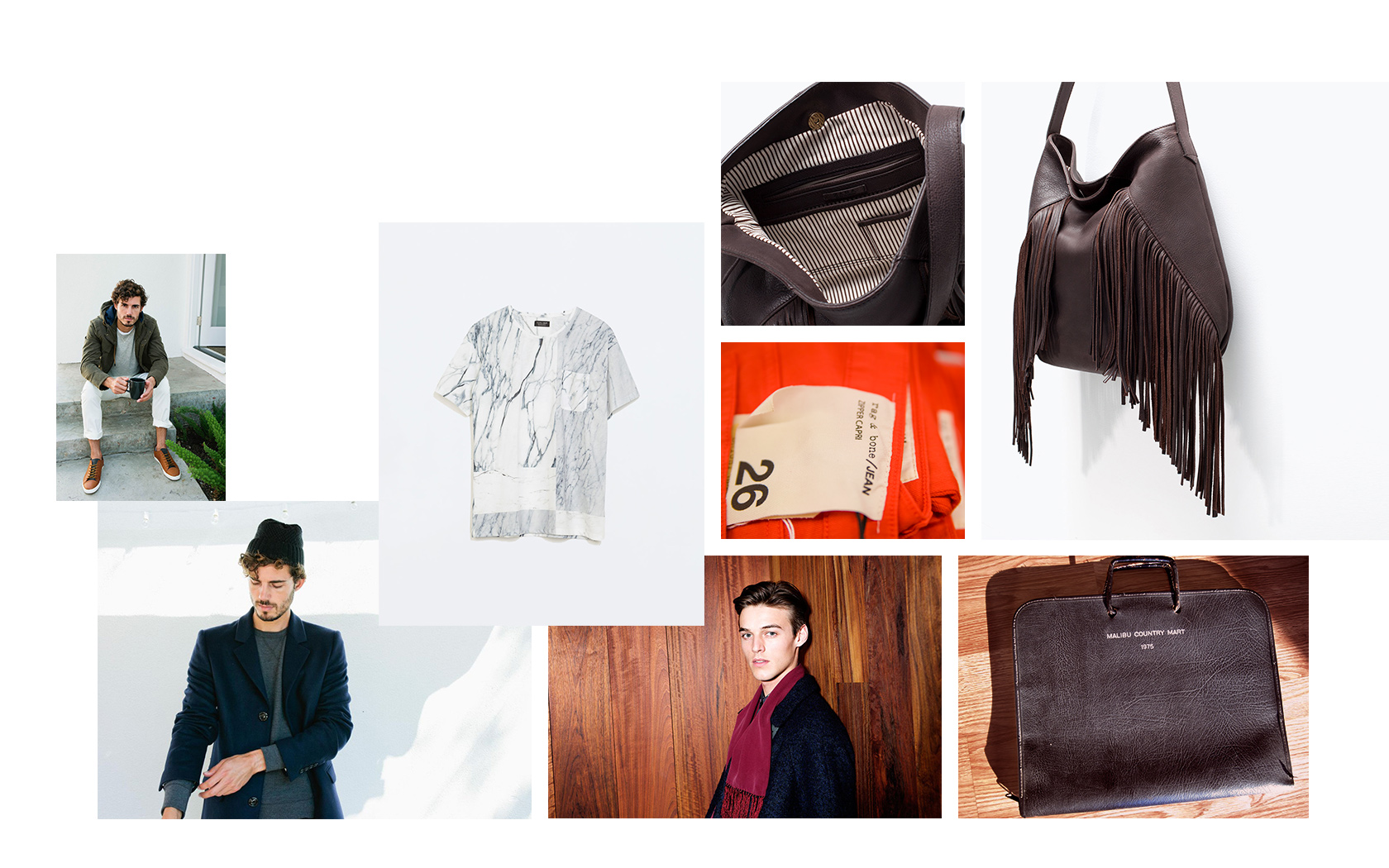
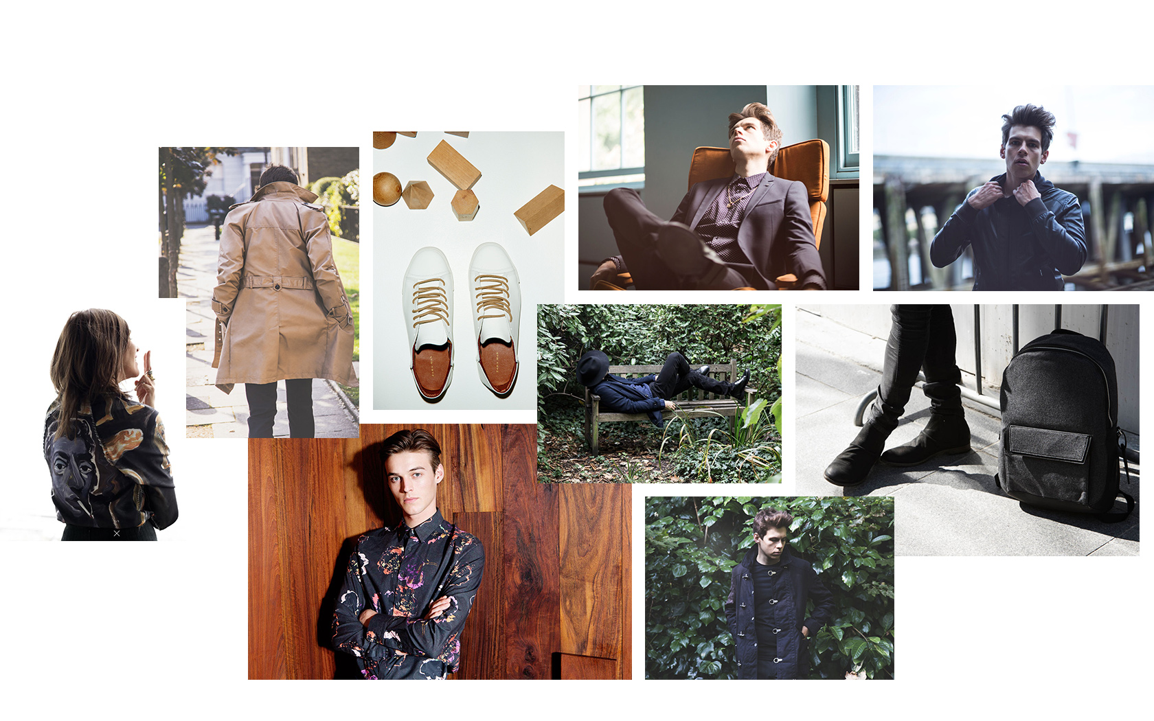
Photography Direction: Editorial
Conveys luxurious yet laid back sophistication with an element of surprise. Unique, iconic, honest, LA.
Models: engaged in telling a story, strong personality, relaxed lifestyle.
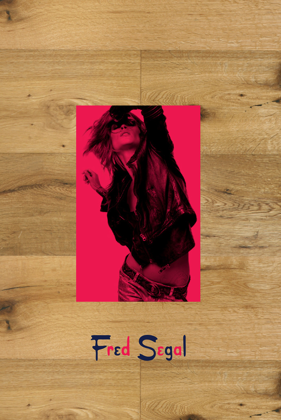
Still shots: quirky styling on white or wood background.
Key elements: ivy, wood, white, soft backgrounds.
Product Photography
Simple. Honest. With personality.
The main and detail shots are photographed on mostly white, minimal backgrounds.
The use of wood is encouraged for the secondary shots to tie them back to store interiors and provide a warm contrast to the main shots.
Detail shots are cropped in close on interesting details.
The personality is achieved through styling and model direction.
